U.S. City Branding
Rockland, Maine

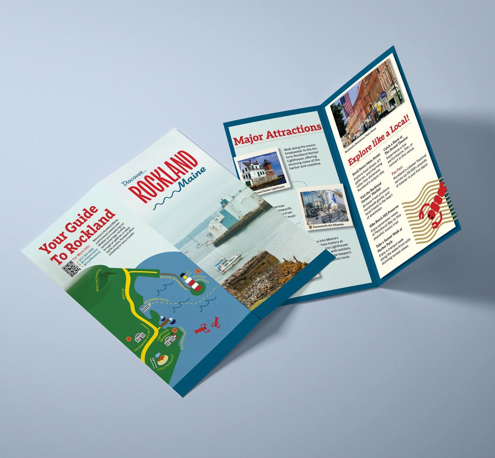
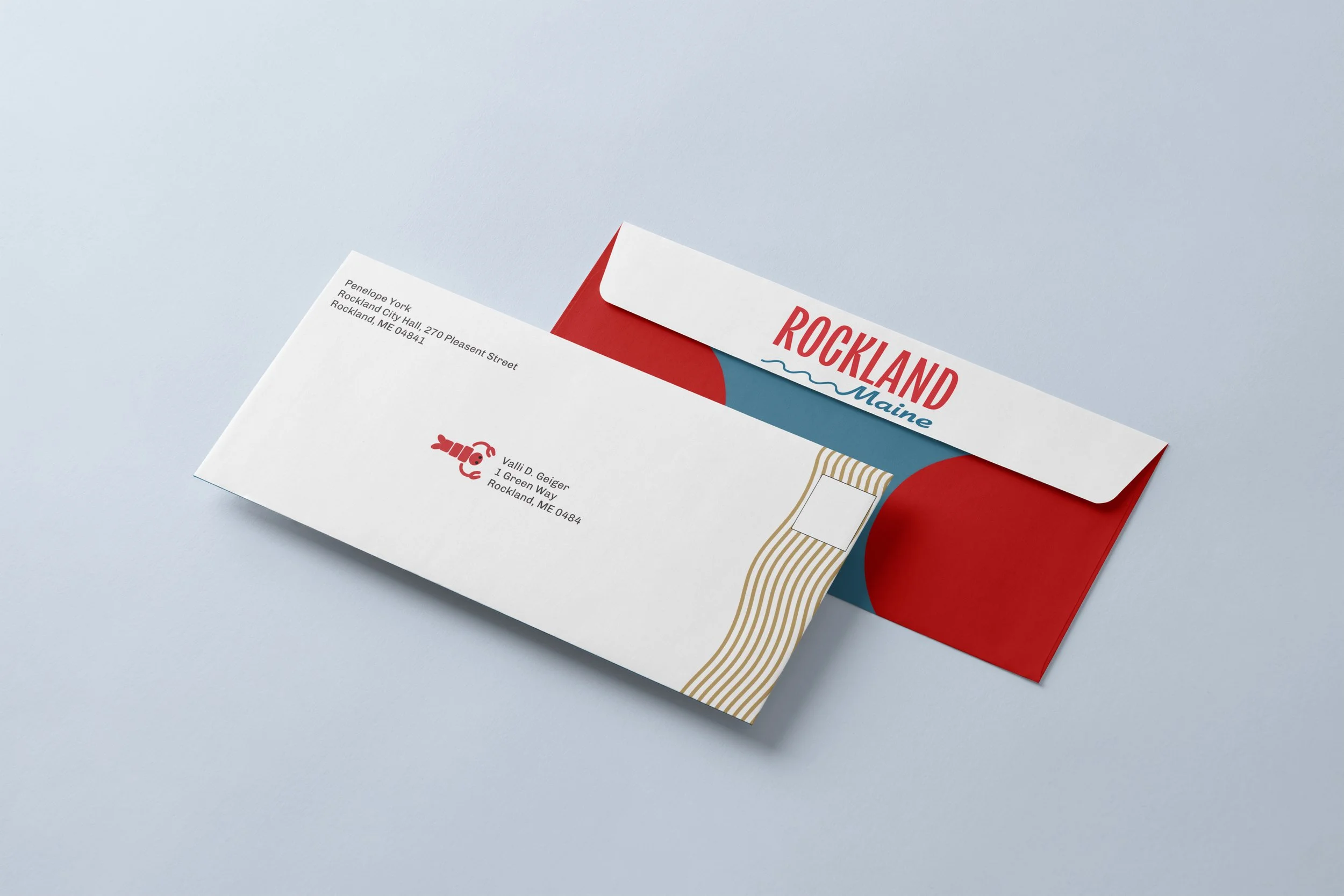
For the US City Branding project, I chose Rockland, Maine, a city known for its coastal charm and lobster industry. I developed a coastal and friendly theme, emphasizing this choice with bright colors and an illustrated style, particularly in my map illustration on the back of the brochure. Throughout my design, I used consistent elements—such as waves and lobsters—and a unified typeface to establish a cohesive identity system. To create hierarchy, I varied typography through different typefaces, bold and unbolded text, red and black color contrasts, and capital letters or a wavy line element underneath the key text. I achieved balance by incorporating a consistent blue border, whether as a bottom line, surrounding the stationary, or framing sections within the brochure.
Final Design

Influential Sketches


Initial Moodboard
Research
Identity and Perception
Rockland’s identity is rooted in its maritime and artistic heritage. The current branding emphasizes its status as a cultural/historical hub, attracting artists, musicians, tourists, and lobster lovers. Public opinion often highlights Rockland’s blend of historic charm and contemporary vibrancy.
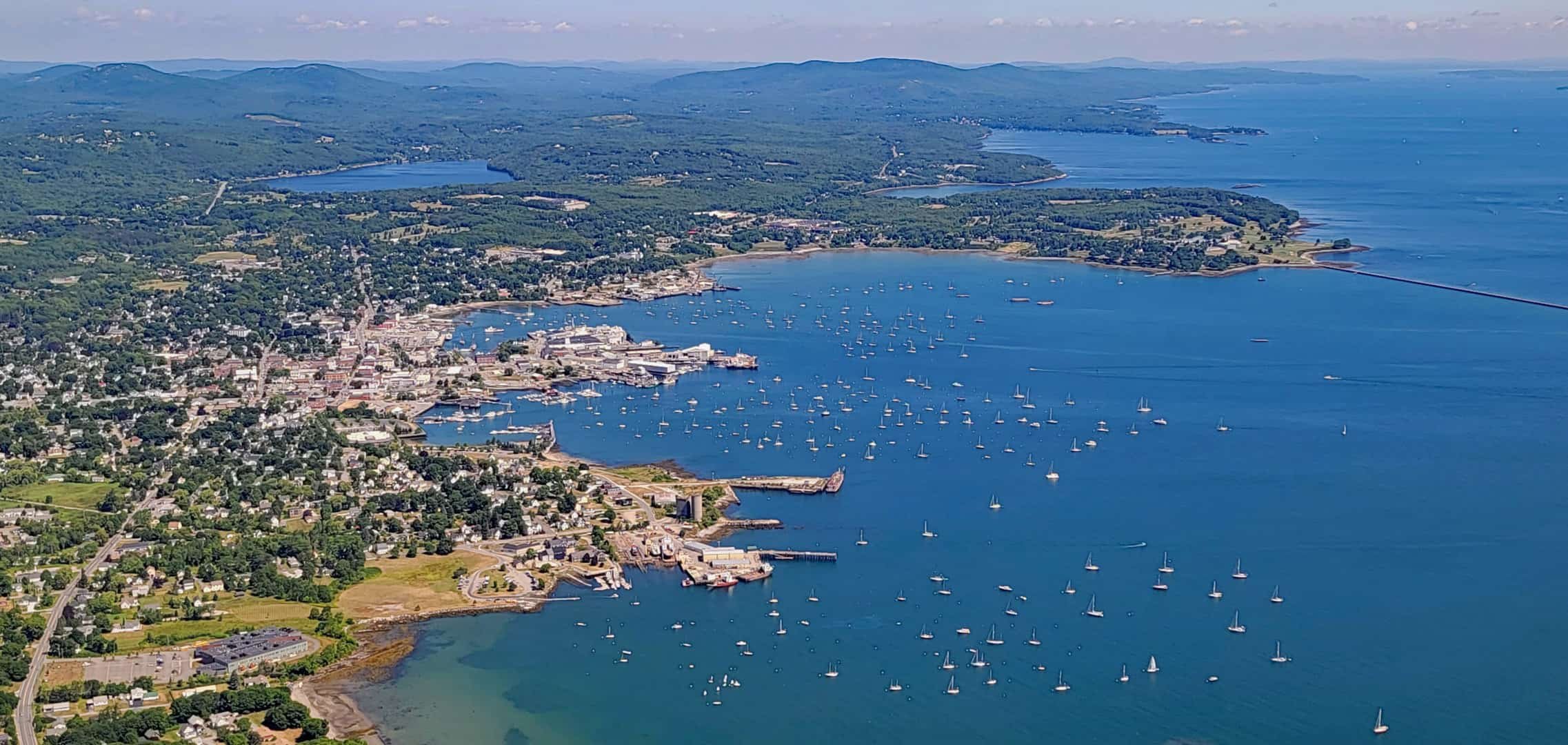
Geography and Environment
Historically dubbed “The Lobster Capital of the World” and used to be “The Lime City.” The economy has transitioned from shipbuilding and lime production to tourism, arts, and maritime services.
Brand Guideline Sheet

Stationery Set

Brochure